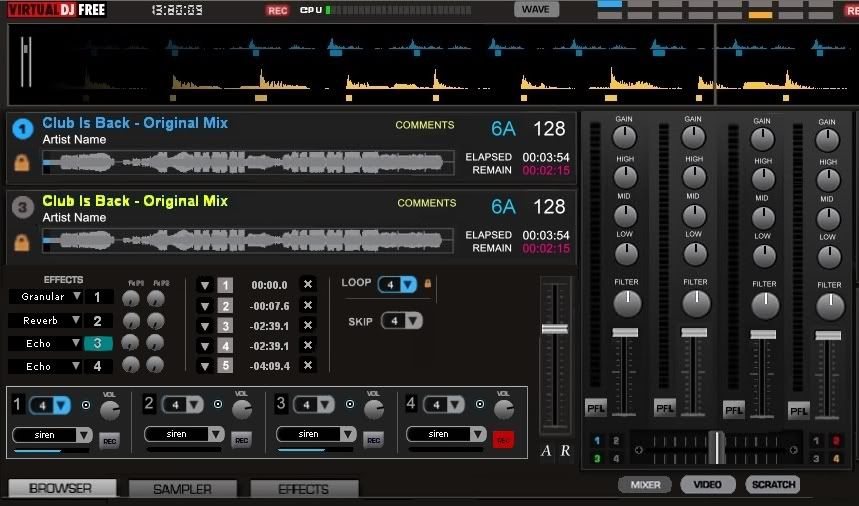
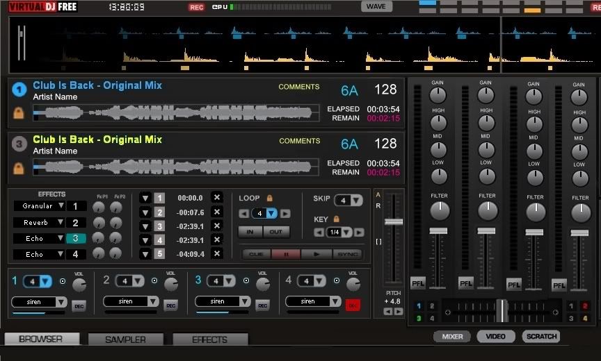
This would be a skin aimed at 4 deck controllers like the MC6000, NS6, S4 and EDM mixing.
I am only providing the concept, since i have no experience skinning I really hope someone will pick up the project and make it happen.
The idea is to maximize visual info feedback. I am not entirely opposed to adding play, pause buttons but as of now id like to focus on relaying info rather than controlling. If there is space left buttons can be added.
The concept is a combination of the regular VDJ7 4deck skin and Virtual Scratch 2.2.1 and some of my own ideas.
The deck panels are there to show you essential information about the track.
The effects, hot cues, loop and pitch slider panel is deck specific. Changing between decks 1-3 and 2-4 will show the effects, cue points, pitch slider and loops loaded/engaged for that specific track. This way you can have 4 different effects loaded up on 4 different decks for a total of 16 effects.
One thing i am not sure about is sure whether LOOP information should be on each deck panel (ie where the track name and info is). I think it might turn out to be more useful to see whether each deck is looping without having to change the deck view panel.
The sample section is somewhat inspired by traktor however since samples are not attached to decks you can have samples 1-4 loaded on the left side (deck 1-3 side) and 5-8 loaded on the right side (deck 2-4 side) hence being able to see info about 8 samples simultaneously.
What i havent seen anywhere else and think should be displayed in the sample section is the loops size of the sample.
Just like regular loops you can see if the sample is a 1 shot or is looping and what is the loop size.
In the Mixer section I have also added a FILTER knob. I have moved down the Mixer, Video, Scratch buttons to the bottom and moved the Browser Sampler Effects Recording buttons to the left (although if the skin works as hoped you will not need to use those at all since everything will be visible and accessible in 1 place).
As you can see the concept is not final given the empty spaces. What i am hoping is that the community suggestions will fill in the blanks and hopefully some brave soul will make this into an actual skin.
* Right click on the pic and select View Image to see the full sized pic.

Mensajes Tue 06 Sep 11 @ 5:24 pm
I have finalized the draft of what it would look like. Let me know if there are any suggestions or if anyone is willing to take on and actually build this.


Mensajes Wed 07 Sep 11 @ 12:29 pm

PS,
I really like this skin, can you add the option to remove the waves.
Mensajes Wed 07 Sep 11 @ 2:41 pm
As i mentioned before I am not great skinning expert and this is just a graphic representation of how the skin would look like.
Whoever decides to build it can include other options as well such as getting rid of waveforms.
The level difference between the mxier and decks is just a matter of positioning the various panels.
Whoever decides to build it can include other options as well such as getting rid of waveforms.
The level difference between the mxier and decks is just a matter of positioning the various panels.
Mensajes Wed 07 Sep 11 @ 4:07 pm
Understand,
It's a nice skin and I would really appreciate it, I'm sure a skinner will take this on.
It's a nice skin and I would really appreciate it, I'm sure a skinner will take this on.
Mensajes Wed 07 Sep 11 @ 4:58 pm
The default skin has the main preview window and then two underneath it, would it be possible to have four preview windows all the same size to save switching back n forth.
I only really use preview to make sure it's not a karaoke track.
Why no other responses to this one it's a great layout!
I only really use preview to make sure it's not a karaoke track.
Why no other responses to this one it's a great layout!
Mensajes Thu 08 Sep 11 @ 5:49 am
What do you mean by preview windows?
Mensajes Thu 08 Sep 11 @ 2:09 pm
Below the mixer you have three options, one of them is video this will show the video preview windows. The default has two - left and right and one on top - the main screen. Would be better to have 4 preview screens.
Mensajes Thu 08 Sep 11 @ 6:46 pm
Ah i see. Yea i havent really bothered doing graphics for the video version but if someone want decides to pick up the project they can certainly do 4. Although id imagine mixing 4 videos might look very messy.
Mensajes Fri 09 Sep 11 @ 9:27 am
MeowMix wrote :
Ah i see. Yea i havent really bothered doing graphics for the video version but if someone want decides to pick up the project they can certainly do 4. Although id imagine mixing 4 videos might look very messy.
no not really...a lot of people here are doing it allready,and taking advantage of VDJ 7'S full specs...
Mensajes Fri 09 Sep 11 @ 11:50 pm
It's not about mixing 4 videos, it's about previewing 4 videos without having to switch between preview screens.
Mensajes Mon 12 Sep 11 @ 4:00 am
I could jump on this project, but I have ONE question:
Do the graphics have to be the default ones (from the default skin) or could we use any kind of graphics as soon as we keep the project's layout?
Do the graphics have to be the default ones (from the default skin) or could we use any kind of graphics as soon as we keep the project's layout?
Mensajes Mon 12 Sep 11 @ 4:36 am
It's not for me to say however I do like it as it is.
Mensajes Mon 12 Sep 11 @ 11:35 am
Hey Phantom thanks for offering to take it up.
I kinda used the default ones because they are clear and simple which i think is very important since its not about fancy looks but efficiency in relaying the info. From what i have seen in different VDJ skins, traktor, serato and torq usually varying contrasts of grey are easiest on the eye vs really dark or really colorful ones.
Aside from that i have no particular attachment to the graphics and Id be very excited to see what you come up with.
Mensajes Mon 12 Sep 11 @ 2:49 pm
I'm asking because I can create this skin using "similar" graphics and keeping the default color scheme, but I can't create this skin using the EXACT graphics...
Which screen res do you prefer?
Which screen res do you prefer?
Mensajes Mon 12 Sep 11 @ 3:24 pm
Thats definitely not an issue for me since i am just providing the concept.
Id say the most common resolutions for controller using DJs are 1280x800, 1366x768 and 1400x900.
Thanks a ton for your involvement.
Id say the most common resolutions for controller using DJs are 1280x800, 1366x768 and 1400x900.
Thanks a ton for your involvement.
Mensajes Mon 12 Sep 11 @ 3:32 pm
MeowMix wrote :
Thats definitely not an issue for me since i am just providing the concept.
Id say the most common resolutions for controller using DJs are 1280x800, 1366x768 and 1400x900.
Thanks a ton for your involvement.
Id say the most common resolutions for controller using DJs are 1280x800, 1366x768 and 1400x900.
Thanks a ton for your involvement.
1366x768 - 1440x900
Mensajes Mon 12 Sep 11 @ 3:46 pm
Ok. I'll jump to this... I will start with 1440x900 since this is the native screen resolution of one of my laptops and then I will downscale to 1366 x 768.
I don't know if I will make it 1280 x800 though... We shall see. I will keep you updated...
PS: The reason I'm doing this is that I need to get back to skinning but my inspiration have left me... :P So, I'm hoping that my inspiration will come back once I start with a project and help me go on with my other projects. Thanks!
Mensajes Tue 13 Sep 11 @ 1:51 am
Mensajes Tue 13 Sep 11 @ 7:27 am
Looks slick as hell.
Id keep the master vol controls in the top horizontal bar for 3 reasons.
1 - You rarely mess with the master volume controls so it doesnt really need to be centrally located.
2 - Having the master VUs next to the channel ones might be a little distracting. I can't fully picture but it might be hard on the eyes.
3 - Moving it to the top horizontal bar allows you to shrink it easily without having to change the graphics much to fit a 1366x768 resolution.
Im guessing you will be adding this eventually but just in case, the knobs do need some kind of a line/groove/dot that shows how far to left or right they've been turned.
Something like this:

Mensajes Tue 13 Sep 11 @ 12:50 pm


