


 music234
On my hp:
Delete played sets on block.
Or did I missed something?
Delete played sets on block.
Or did I missed something?
Mensajes Tue 12 Dec 17 @ 9:30 pm
 groovindj
When using the search box to look for posts containing a particular word or phrase, the results don't seem to come back in any kind of order.
Why not? Can we please have results sorted by date (most recent posts first)?
Why not? Can we please have results sorted by date (most recent posts first)?
Mensajes Sun 14 Jan 18 @ 10:02 am
 geemix
synthet1c wrote :
can you add a mac and pc logo to people's avatar description that is selectable in the "Modify My Profile" page... It would make it easier to tailor responses more specifically to someone's operating system with that extra little bit of information.
Now why did they not think of that before :)
Mensajes Sun 21 Jan 18 @ 10:38 am
 PachN
PachN
It wasn't necessary before. There were separate WIN and MAC technical support forums. But since they got consolidated such an info sometimes can be helpfull.
Or... the user seeking help just provides usefull infos in the first place.
Or... the user seeking help just provides usefull infos in the first place.
Mensajes Sun 21 Jan 18 @ 12:07 pm
 klausmogensen
A new version af the comparison chart for mobile phones would be great. It's a bit hard to read at the moment:
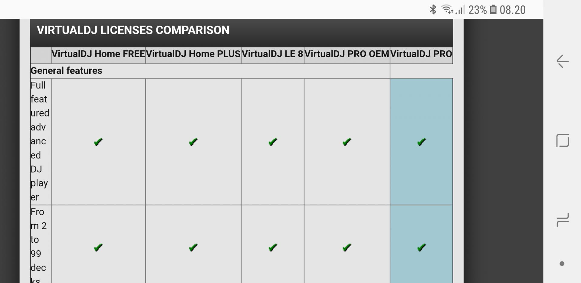
Mensajes Wed 28 Mar 18 @ 6:23 am
groovindj
The site as a whole is not very user friendly on a smartphone. Navigation needs to be easier.
Clicking on a hyperlink displayed as text in a thread

is fine when using a mouse, but on a phone with your finger it's a nightmare.
Clicking on a hyperlink displayed as text in a thread
is fine when using a mouse, but on a phone with your finger it's a nightmare.
Mensajes Wed 28 Mar 18 @ 5:31 pm
I lost earlier sets from my history, due to a failed laptop.
If there was a way to download-import my earlier played sets from my VDJ online account.
A download function like a "download to m3u file" , that would be great....
If there was a way to download-import my earlier played sets from my VDJ online account.
A download function like a "download to m3u file" , that would be great....
Mensajes Wed 04 Apr 18 @ 1:17 am
 OceanBob
Quoting would be easier if you could select a part of a comment with the left part of the mouse , then right-click on the selected text , and see the word 'quote' , and then left-click 'quote' . That must be easier then quoting a whole comment and then having to remove parts . A lot of forums work this way.
Mensajes Mon 16 Apr 18 @ 8:14 am
groovindj
Please make the forum more "responsive" i.e. easier to use on smartphones.
At the moment, navigating between the various forum areas on a phone screen is extremely difficult because of the "thread display" to the top right hand side, which is far too small for touching accurately with a finger.
Also certain forum areas just do not display correctly on a phone screen - such as the feature comparison chart.
Mensajes Thu 21 Jun 18 @ 6:39 pm
PachN
If a post or thread is not your level can it please not be displayed on the forum overview?
I just keep clicking on that forum and can't see anything -_-

I just keep clicking on that forum and can't see anything -_-
Mensajes Fri 13 Jul 18 @ 8:35 am
 kradcliffe
Reported this years ago. You are seriously wasting your time as the site is just totally neglected.
Mensajes Fri 13 Jul 18 @ 8:45 am
 lincol2
@PachN
+
+
Mensajes Fri 13 Jul 18 @ 3:23 pm
OceanBob
Can we PLEASE quote selected text , instead of a whole post ? That would be 10 times easier . I'm sure many users would appreciate this .
Mensajes Thu 16 Aug 18 @ 9:40 am
") Dan (djtouchdan)
Dan (djtouchdan)
Just press the quote button then delete the parts of text you don't want.
Mensajes Sat 18 Aug 18 @ 12:31 pm
OceanBob
You mean : why make it easy when you can make it complex ? That makes sense .
Mensajes Sun 19 Aug 18 @ 8:41 am
groovindj
You think editing a little bit of text is complex?
Mensajes Sun 19 Aug 18 @ 9:09 am
OceanBobgroovindj wrote :
You think editing a little bit of text is complex?
There are large posts , from which you may like to quote 3 or 4 short sentences , that aren't necessarily in line . In that case, it's pretty difficult to edit it all together.
Mensajes Sun 19 Aug 18 @ 9:22 am
groovindj
Well it's all relative I suppose. I've been using computers to read, post and edit text online for decades, and I don't have any issues at all editing bits out of quotes on here - no matter how verbose the original was.
As long as you're familiar with the keyboard shortcuts for editing text (as anyone using a computer ought to be) then I don't see how it can be called complex or difficult.
As long as you're familiar with the keyboard shortcuts for editing text (as anyone using a computer ought to be) then I don't see how it can be called complex or difficult.
Mensajes Sun 19 Aug 18 @ 9:29 am
OceanBob
It's just that I know this Dutch website (HardwareInfo.nl) about computers , that uses this selected text quote system . I thought it is pretty relaxed .
Mensajes Sun 19 Aug 18 @ 9:50 am
Dan (djtouchdan)
You can always type the quote element yourself then copy and paste the sentences??
Assuming that isn't too complex.
[q uote] paste here [/quote]
Assuming that isn't too complex.
Mensajes Mon 20 Aug 18 @ 9:42 am