Sorry for my long absence Phantom (life gets in the way).
Your are correct regarding both the skip and sample questions. The 4 in sampler is the size of the sample loop (would be the first skin to show this as far as i know).
And the 4 in the skip section is to skip 4 ahead so it would be something like - / + > 1/8 1/4 1/2 1 2 4 8 16 32.
As for the mixer i have no problem with 1-2-3-4 or 3-1-2-4. I currently use 1-2-3-4 but can easily remap things to work with the alternative.
One thing that would be nice to have carry over from the default one is splitting the waveform bar into 2 parallel sets with waveforms for decks 1-2 on top and 3-4 at the bottom.
Having them all overlap looks just a little messy and makes correcting for drifts during a 4 deck mix impossible.
By the way, the skin look gorgeous. I am literally salivating at the prospect of using it.
Mensajes Fri 23 Sep 11 @ 12:10 am
For the sampler:
There is a reason that there's no skin displaying the loop length: VDJ does not report it! I'm trying a few ideas to get a "sample loop length" and put it there but nothing is done yet...
However today I believe that I will be able to finish with the main graphical design, so tomorrow I must be able to start coding.
I have left a few things as a surprise ;)
PS: Since this skin is based on your "project" and it has been community driven on it's functions/design/e.t.c. maybe it's time to find a name for it ?
I'm waiting for suggestions!
Mensajes Fri 23 Sep 11 @ 12:50 am
Aha, that makes sense now. I am very interested in these surprises.
Names...
Phantom 4-CTRL
Phantom 4
InfoView
4-Mix Control
...
Names...
Phantom 4-CTRL
Phantom 4
InfoView
4-Mix Control
...
Mensajes Fri 23 Sep 11 @ 11:57 am
Hi Phantom,
looks great. My suggestions:
- fab 4
- 4 Control
Greets
looks great. My suggestions:
- fab 4
- 4 Control
Greets
Mensajes Sat 24 Sep 11 @ 12:22 am
Community Project
Community Design
Community Skin
Community Design
Community Skin
Mensajes Sun 25 Sep 11 @ 1:16 pm
Just enjoyed catching up on this thread. I hope it's the first of many community based skin collaborations.
As for names, how about phab4phantom... a play on Fab 5 Freddy!
Roy
As for names, how about phab4phantom... a play on Fab 5 Freddy!
Roy
Mensajes Sun 25 Sep 11 @ 5:21 pm
GadgetMan wrote :
phab4phantom
Sounds good
Mensajes Sun 25 Sep 11 @ 5:35 pm
An absolute must of a feature is to have selectable buttons for music, music videos and videos, see image below.
Image from Blacksheep ultimate

Image from Blacksheep ultimate

Mensajes Mon 26 Sep 11 @ 11:33 am
You done anymore George?
Mensajes Tue 27 Sep 11 @ 2:05 pm
Coding is on progress...
Graphically wise there are a few elements (plus some functions) left for surprise... :P
Once I finalize a few things I will post a screenshot of VDJ running this skin instead of Photoshop Graphics ;)
Graphically wise there are a few elements (plus some functions) left for surprise... :P
Once I finalize a few things I will post a screenshot of VDJ running this skin instead of Photoshop Graphics ;)
Mensajes Wed 28 Sep 11 @ 1:38 am
Dopeness.
Mensajes Wed 28 Sep 11 @ 3:53 pm
Mensajes Wed 28 Sep 11 @ 6:05 pm
obligatory

Jokes aside it look really really really sleek, way beyond what i had hoped.
P.S. i like your track selection too.

Jokes aside it look really really really sleek, way beyond what i had hoped.
P.S. i like your track selection too.
Mensajes Wed 28 Sep 11 @ 9:59 pm
Phantom,
I don't like the textzone colors (but that can easily be changed), but I love everything else!!
Certainly my next default skin.
What resolution is it? sorry if the question was already asked.
I don't like the textzone colors (but that can easily be changed), but I love everything else!!
Certainly my next default skin.
What resolution is it? sorry if the question was already asked.
Mensajes Thu 29 Sep 11 @ 2:11 am
1440X900 is the initial resolution. Once finished I will code 1368 first and then 1920.
Mensajes Thu 29 Sep 11 @ 3:09 am
Jerem do you have any suggestions for the textzones colors ?
Thanks!
Thanks!
Mensajes Thu 29 Sep 11 @ 3:10 am
I love the skin and really appreciate you taking it on.
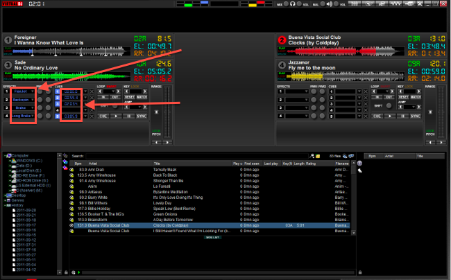
I too don't like the text colours, I prefer standard white colour for the loops and effects.
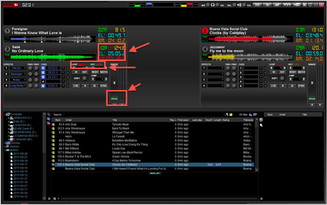
Also standard white for track info, loop effects etc.
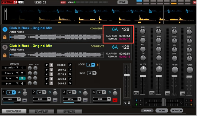
Looking at it again I have to say that I defiantly prefer the originals track info, I link it's cleaner and more professional looking.
I too don't like the text colours, I prefer standard white colour for the loops and effects.

Also standard white for track info, loop effects etc.

Looking at it again I have to say that I defiantly prefer the originals track info, I link it's cleaner and more professional looking.

Mensajes Thu 29 Sep 11 @ 4:42 am
Same suggestions as Charlie.
White or light grey.
I too prefer the original track info, although I like seeing the BPM with two decimal digits and the key (camelot) is a bit too big.
White or light grey.
I too prefer the original track info, although I like seeing the BPM with two decimal digits and the key (camelot) is a bit too big.
Mensajes Thu 29 Sep 11 @ 7:31 am
The color difference between Elapsed and Remaining is important and I also like the fact that it turns red once you hit a certain amount of seconds left.
Guys keep in mind that its not about color but rather visibility. You shouldnt have to look twice to be able to read what the text says.
The best option is a Font + Color combo that makes it easy and quick to read.
Too much gray/white can also be counter productive since it would prevent you from immediately focusing on the specific text area.
If Phantom is ok with making changes we should settle on the most popular Font + Size + Color combo that also matches the rest of the skin.
(if you end up not liking the default, changing the code for font and color is fairly easy and you can do it yourself)
Mensajes Thu 29 Sep 11 @ 8:01 am
There has been a lot of interest and feedback with this skin and George has remained committed which should mean that it won't be long before it's released, I'm sure it wont take long to get approved.
Although I feel guilt sometime with what I post, I feel I have to be honest so that we achieve the best outcome. Same goes for VDJ as a whole!
I just wish more people would contribute, hats off to meowmix for originally making the effort to design a mock skin.
Although I feel guilt sometime with what I post, I feel I have to be honest so that we achieve the best outcome. Same goes for VDJ as a whole!
I just wish more people would contribute, hats off to meowmix for originally making the effort to design a mock skin.
Mensajes Thu 29 Sep 11 @ 8:22 am


