1388x ????
I thought 1366x is the standard....
1366X version is coming out next week ;)
I thought 1366x is the standard....
1366X version is coming out next week ;)
Mensajes Fri 04 Nov 11 @ 1:07 pm
Just to confirm, 1366 will be fine :)
Mensajes Fri 04 Nov 11 @ 1:26 pm
And after your finished with Charlies request,can u make me 2 @ 1280x800 AND 1400x1000?...he,he..just playing...I mean u dont have to...
.....:-P
.....:-P
Mensajes Fri 04 Nov 11 @ 7:44 pm
I resized to 960 x 600 LOL it looks great, amazing work phantom :)
Mensajes Fri 04 Nov 11 @ 10:33 pm
I loaded this skin on to my spare gig machine which is 1440x900 and it looks great.
I love the skin and will get a buzz out of it each time I load it up.
I took the time to review the skin and highlight suggestions.
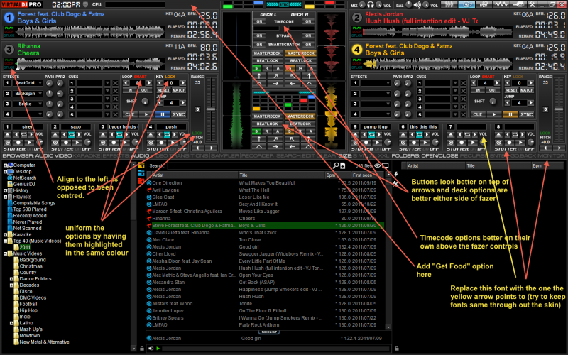
Also I can't get used to the pause buttons been to the right of the play buttons.
I love the skin and will get a buzz out of it each time I load it up.
I took the time to review the skin and highlight suggestions.

Also I can't get used to the pause buttons been to the right of the play buttons.
Mensajes Sat 05 Nov 11 @ 9:45 am
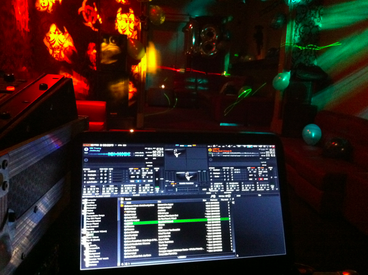
First night on the job with it, it was great.

Mensajes Sat 05 Nov 11 @ 9:26 pm
Charlie Wilson wrote :
Also I can't get used to the pause buttons been to the right of the play buttons.
Also I can't get used to the pause buttons been to the right of the play buttons.
I will fix that on the next update. I thought I copied the physical layout of the original skin but it seems that I messed them up.
On my skins I only use TWO control buttons...
Mensajes Sun 06 Nov 11 @ 5:48 pm
Also to consider for the next update is the feature of advanced manual bpm correction.
In the default skin on the deck (top right corner) if you right click on the BPM button it opens the bpm/beat gird editing panel which is very handy for on the fly gird corrections.
In the default skin on the deck (top right corner) if you right click on the BPM button it opens the bpm/beat gird editing panel which is very handy for on the fly gird corrections.
Mensajes Mon 07 Nov 11 @ 9:28 am
Did you tried to right click on the "sync" button ?
Mensajes Mon 07 Nov 11 @ 11:08 am
Heres an idea,
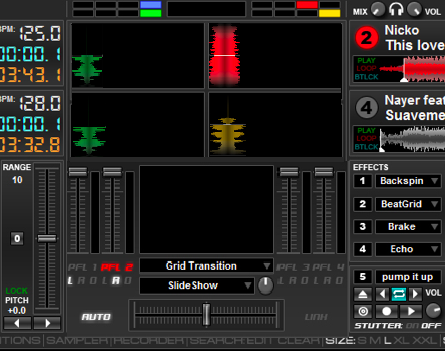
You could have video 2 mode, basically the same but with scratch panels as well.
This image is just something I knocked up and isn't accurate, i.e. the lines dont line up and one of the scratch colours is wrong but you get the idea.

You could have video 2 mode, basically the same but with scratch panels as well.
This image is just something I knocked up and isn't accurate, i.e. the lines dont line up and one of the scratch colours is wrong but you get the idea.
Mensajes Mon 07 Nov 11 @ 12:05 pm
PhantomDeejay wrote :
Did you tried to right click on the "sync" button ?
fantabulous, thanks.
Mensajes Mon 07 Nov 11 @ 1:28 pm
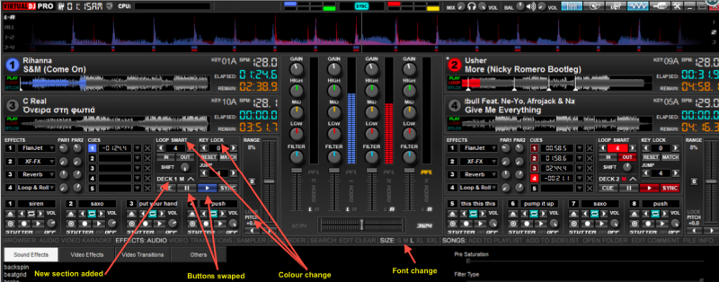
Skin just looks better and better.
Mensajes Mon 07 Nov 11 @ 5:48 pm
You found most of them. You only missed the small white dots next to the deck selectors ;)
Mensajes Tue 08 Nov 11 @ 12:42 am
I\'m working on the 1600x900 (extra wide) version right now since it requires less time to complete (resizing a skin up is always easier than resizing it down)
So, how does this looks ? Is it ok with you ?

So, how does this looks ? Is it ok with you ?

Mensajes Tue 08 Nov 11 @ 3:59 am
Yeah looks great
Mensajes Tue 08 Nov 11 @ 5:02 am
Looks great, but having difficulty seeing what's changed... lol
Roy
Roy
Mensajes Tue 08 Nov 11 @ 6:34 pm
It has scratchwaves on the left/right side of the mixer
Mensajes Wed 09 Nov 11 @ 12:52 am
So it does... very cool
Mensajes Wed 09 Nov 11 @ 1:56 am
Dear PhantomDeejay
You did a fantastic job.
Could I ask about two wishes for me?
1. A Resolution 1280 x 800 for my MACBook 13"
2. Please change the colour and perhaps the Layout of the desks.
Colour:
Deck 1: Yellow - Deck 2: BLUE - Deck 3: GREEN - Deck 4: RED
Layout:
Deck 3 - Deck 1- Deck 2 - Deck 4
In my opinion this is the best colour layout to work in clubs where the light is shutdown.
Beautiful Greetings
chris
Mensajes Wed 09 Nov 11 @ 3:34 am


