If it is possible in the "preparation" mode the "Gain" knobs. If i maintenance my MP3 i often have no controller connected. At the moment if i have a "Bad" Gain i have to change to another Skin. Would be great if it is possible to do directly in the preparation skin.
Mensajes Sat 18 Mar 17 @ 10:34 am
Best skin ever for me :)
Mensajes Mon 20 Mar 17 @ 12:32 pm
It's true. It is very nice.
Mensajes Wed 22 Mar 17 @ 12:12 pm
Looks Good
Waiting for this
Waiting for this
Mensajes Sun 26 Mar 17 @ 2:30 pm
Very nice skin. I'll start use it.
Mensajes Wed 29 Mar 17 @ 9:26 am
Quick Poll:
What would you like to see on the empty space ?
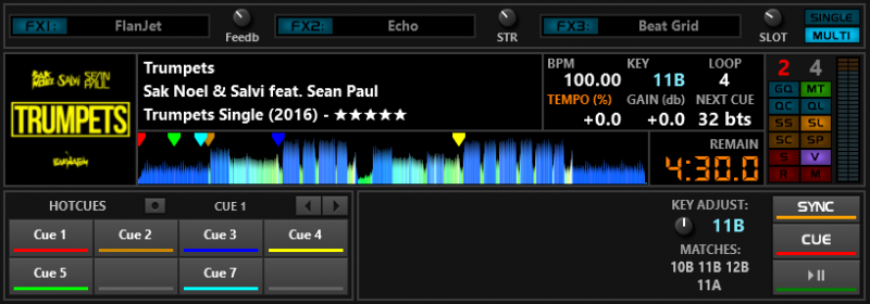
What would you like to see on the empty space ?

Mensajes Tue 16 May 17 @ 11:24 am
Well being a video dj I say add a preview screen. But with out seeing the whole skin it makes it hard to see what else is needed.
Mensajes Tue 16 May 17 @ 3:13 pm
PhantomDeejay wrote :
Personally I never gig on a monitor lower than 19 inch, and I realized that the bigger advantage of SilverSleek #3 was it's greatest disadvantage at the same time.
SilverSleek #3 was designed on 19, 23 and 32 inch monitors. It's primary goal was to fit as many usable controls in as much less space possible in order to leave plenty of room for the browser.
While this logic works well on large monitors, it does not work that well (dare I say at all) on small ones!
Hmmm...... George, I seem to remember mentioning about this to you at the BPM Show at the NEC a long time ago lol.
I couldn't use your SilverSleek skins as the text was too small on my 15" MBP screen.
Mensajes Wed 17 May 17 @ 12:23 am
PhantomDeejay wrote :
Quick Poll:
What would you like to see on the empty space ?

What would you like to see on the empty space ?

Grid adjustments
Mensajes Wed 17 May 17 @ 1:21 am
Djratedxxx919 wrote :
Grid adjustments
Grid adjustments
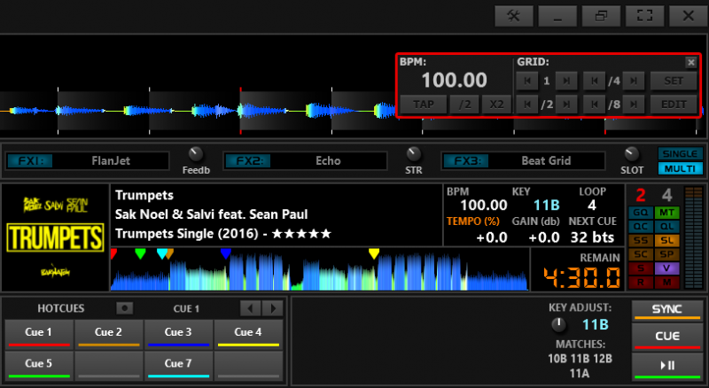
Already present!
Anything else ?
Mensajes Wed 17 May 17 @ 6:04 am
Maybe an area for custom knobs and buttons? Let the user decide knob or button and how many.
Mensajes Wed 17 May 17 @ 4:29 pm
groovindj wrote :
Maybe an area for custom knobs and buttons? Let the user decide knob or button and how many.
Since there is already a row with custom buttons between the decks and the browser, custom buttons & knobs would be my last resort solution
Mensajes Wed 17 May 17 @ 8:19 pm
PhantomDeejay wrote :

Already present!
Anything else ?
Djratedxxx919 wrote :
Grid adjustments
Grid adjustments

Already present!
Anything else ?
I see the option but a permanent setting, but the custom button and knobs sound good. That way I could do custom grid adjustment without having to bring up the option and others can do what they feel.
Mensajes Wed 17 May 17 @ 8:30 pm
I do have a question is it possible to customize the info planes on the right side of the browser? The info plane to be exact.
Mensajes Wed 17 May 17 @ 8:32 pm
PhantomDeejay wrote :
Since there is already a row with custom buttons between the decks and the browser
Since there is already a row with custom buttons between the decks and the browser
But I wasn't to know that. You only posted a picture of the deck area. :-)
It's clearly been redesigned (it doesn't match any previously posted images) so it's not obvious what exists and what doesn't.
the SOUND INSURGENT wrote :
with out seeing the whole skin it makes it hard to see what else is needed.
Mensajes Wed 17 May 17 @ 9:24 pm
Djratedxxx919 wrote :
I do have a question is it possible to customize the info planes on the right side of the browser? The info plane to be exact.
have you tried clicking on the dot next to the pre-listen on info pane and selecting fields?
Mensajes Wed 17 May 17 @ 9:31 pm
It's not redesigned.
It's the fourth view that I didn't bother finish the last 2 maybe 3 months.
The other 3 views (Compact, Display Only & Automix) are visible above.
I posted a pic of the deck only because pictures get resized when uploaded.
A full screen image would prevent you to see the deck in detail.
Anyway, keep the suggestions coming!
Mensajes Wed 17 May 17 @ 9:44 pm
Anyone interested on testing latest beta, send me a PM
Mensajes Thu 25 May 17 @ 7:43 am
wickedmix wrote :
have you tried clicking on the dot next to the pre-listen on info pane and selecting fields?
Djratedxxx919 wrote :
I do have a question is it possible to customize the info planes on the right side of the browser? The info plane to be exact.
have you tried clicking on the dot next to the pre-listen on info pane and selecting fields?
I want it to do something totally different, just info is a waste of space since all that same info is in the browser.
Mensajes Thu 25 May 17 @ 11:39 am
Not ALL the info is usually visible on the browser.
The database contains a lot of fields. It's impossible to show all of them on the browser.
The way the info panel is meant to be used is to show "minor" information about the track whilst the browser shows the "major"
What's minor and what's major is up to you...
Therefore you can usually show fields on info panel that you usually keep hidden on main browser.
As for your question, no it's impossible to put any skin elements inside the info panel
Mensajes Thu 25 May 17 @ 12:41 pm


