Hi Babis, when are you planning to update the skin to fix the missing parameter buttons?
I use this as my daily skin now, would also be handy to have the video panel at the top if possible.
Thanks!
I use this as my daily skin now, would also be handy to have the video panel at the top if possible.
Thanks!
kradcliffe wrote :
Hi Babis, great skin!
Noticed if you click on the bar above the pad section it gives the option to change pad param 1 and param 2 but it's not shown on the skin?
Also, can you please add an option to have the video panel above the deck section (below the waveform)
Thank you!
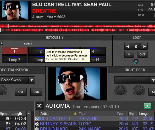
Noticed if you click on the bar above the pad section it gives the option to change pad param 1 and param 2 but it's not shown on the skin?
Also, can you please add an option to have the video panel above the deck section (below the waveform)
Thank you!

Mensajes Tue 19 Dec 17 @ 5:02 am
The skin has the same code with the default ones (i think). Its the Pad page parameters that some default pages have the "Visible" unchecked
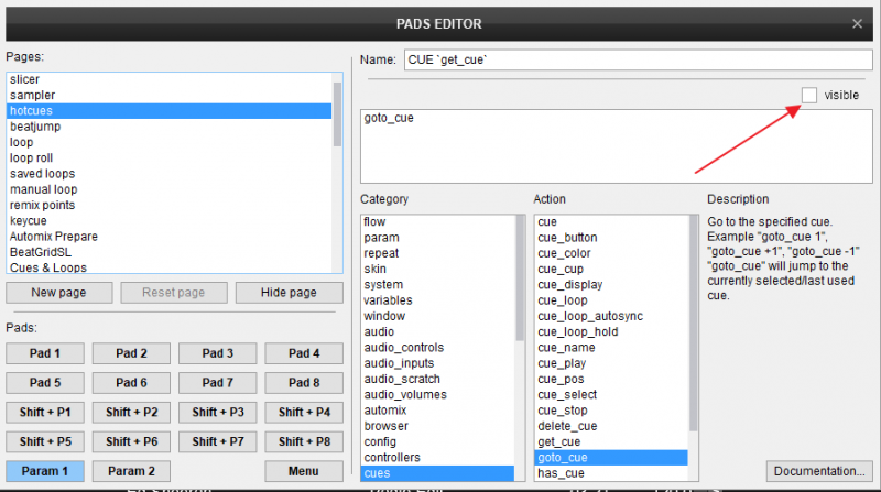
for the Video at top, will try to add in next update, but cant promise any ETA

for the Video at top, will try to add in next update, but cant promise any ETA
Mensajes Tue 19 Dec 17 @ 3:00 pm
Thanks!
Tried ticking the "visible" box and restarting but still nothing appears on the skin.
Tried ticking the "visible" box and restarting but still nothing appears on the skin.
Mensajes Tue 19 Dec 17 @ 3:17 pm
If its the 2nd Parameter of the Hotcue Page that doesnt show up, its because it doesnt have a name. Anyways, its not a skin issue here. Its how the Parameters of the Hotcue page are defined to be displayed
Mensajes Tue 19 Dec 17 @ 3:22 pm
Hi Babis,
I have noticed with experimentalSkinEngine set to yes, when you unload a deck it doesn't clear the waveform display. Please see below.
Thanks - Keith
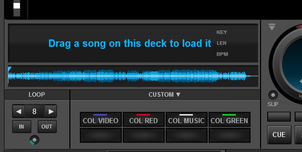
I have noticed with experimentalSkinEngine set to yes, when you unload a deck it doesn't clear the waveform display. Please see below.
Thanks - Keith

Mensajes Wed 17 Jan 18 @ 10:20 am
not related to a specific skin, happens with the default one too, if u have experimentalSkinEngine enabled, so turn it off for now, until its fixed
Mensajes Wed 17 Jan 18 @ 12:13 pm
No problem. I only enabled it because Adion stated in another thread there shouldn't be any issues with the experimental engine now and it reduces CPU use (which it does)
Mensajes Wed 17 Jan 18 @ 12:36 pm
On the right deck, the songpos white triangle is intruding into the adjacent area.
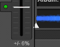

Mensajes Tue 12 Jun 18 @ 9:03 pm
I use this skin daily. But there is some minor glitch: The cue points are not displayed correctly when using the mirrored wave.
Mensajes Tue 24 Jul 18 @ 10:27 am
Excelente Caratula (Skin) apenas lo descargue y me parece que esta genial y voy a usarlo de ahora en adelante, Yo trabajo con Videos y esta caratula permite ver mas grande los videos de cada Deck, también me gusta porque tiene la opción de Subir y Bajar el Tono (Key), en conclusion es muy completo, solo faltaría poder trabajar con 4 Deck pero me imagino que no quedaría casi espacio en la pantalla para agregar mas modulos… Muchisimas Gracias DJDAD por este Skin
Mensajes Sun 16 Dec 18 @ 1:57 pm
Blocks skin got a new major update
Version 2.0
Link : http://www.virtualdj.com/plugins/index.html?addonid=80677
Changelog
- Added 4 Decks skin version
- Darker colors, flat graphics.
- Graphics mostly vectorized, improved performance
- New Small Video Block (mostly when Video Output is in front of you and all u need are the Video controls)
- 3rd Line in Deck Info (2 Decks) can be customized (right-click or from menu)
- Taller waveforms in 2 Decks
- New Custom buttons Block (2 Decks skin)
Have fun with it :)
Mensajes Sat 18 May 19 @ 1:04 pm
Very impressive skin.
BIG thanks for this.
With best regards.
BIG thanks for this.
With best regards.
Mensajes Sat 18 May 19 @ 1:45 pm
Small bugs
4 decks with external mixer layout, the white triangle on the songpos doesn't line up with the actual playhead [not repositioning after mixer shrinkage]
2 decks, custom buttons rack [is it called a rack?] visibility not 100% reliable [try have just fx, sampler & video racks visible]
4 decks with external mixer layout, the white triangle on the songpos doesn't line up with the actual playhead [not repositioning after mixer shrinkage]
2 decks, custom buttons rack [is it called a rack?] visibility not 100% reliable [try have just fx, sampler & video racks visible]
Mensajes Sat 18 May 19 @ 4:42 pm
locodog wrote :
Dont see this. Care to post a screenshot ?4 decks with external mixer layout, the white triangle on the songpos doesn't line up with the actual playhead [not repositioning after mixer shrinkage]
Adjusted a couple pixels in 2.01, but not sure if thats what you have seen. BTW, i have the skinPlayheadShadow setting to No, in order to get best alignments
locodog wrote :
Fixed in 2.01 re-download2 decks, custom buttons rack [is it called a rack?] visibility not 100% reliable [try have just fx, sampler & video racks visible]
Mensajes Sun 19 May 19 @ 9:03 am
2.0


Mensajes Sun 19 May 19 @ 9:37 am
hmm kinda weird. I believe the inverted white triangle in your song progress is probably showing some Saved Loop ?
Judging from the Times, the Play Head should be at the beginning of the track, but i dont see that. I really cant reproduce.
Judging from the Times, the Play Head should be at the beginning of the track, but i dont see that. I really cant reproduce.
Mensajes Sun 19 May 19 @ 10:07 am
TC or Mic button need to be shown for the bug to happen.
Mensajes Sun 19 May 19 @ 11:01 am
With more panels open, the browser gets progressively smaller - but beyond a certain point, the browser icons (left hand side) start piling up on each other.

This image was grabbed from a full HD 1920x1080 screen. Obviously it would occur sooner (with fewer panels open) on a lower res screen i.e. gig laptop.
Would it not be better for this skin design type (panels making the browser smaller) to put the icons along the top edge of the browser where they won't become squashed?
[EDIT] On the old version of the skin, this doesn't happen. The icons actually resize to fit.
Presumably it's related to the b/g graphics being drawn by VDJ?
I encountered something similar a few days ago when I added a colour tint option to a skin. With the tint graphics (drawn by VDJ) being full size behind the browser, the browser wasn't resizing properly. I reduced the tint to just the deck area (so it wasn't hidden under the browser) and the problem went away.
Mensajes Sun 19 May 19 @ 11:19 am
Hi Babis
I've been using your Blocks 1.2 skin for a long time. I have just downloaded your updated Blocks 2.01 and have found an issue with the graphics. All the rotary controls have a square background that is cluttering up the screen on my Mac. Looking at a pic posted above this doesn't appear to be happening on the PC version. It's also happening on the 4 deck version too. I'm using build b4918.

System Specs;
MacBook Pro 15” 2017, 2.9 GHz Intel Core i7, 16 GB 2133 MHz LPDDR3 Memory, Radeon Pro 560 4096 MB, Intel HD Graphics 630 n1536 MB, macOS Mojave 10.14.4, 500gb SSD, external WD Passport Ultra 2Tb HD containing Music, Video & Karaoke databases.
I've been using your Blocks 1.2 skin for a long time. I have just downloaded your updated Blocks 2.01 and have found an issue with the graphics. All the rotary controls have a square background that is cluttering up the screen on my Mac. Looking at a pic posted above this doesn't appear to be happening on the PC version. It's also happening on the 4 deck version too. I'm using build b4918.

System Specs;
MacBook Pro 15” 2017, 2.9 GHz Intel Core i7, 16 GB 2133 MHz LPDDR3 Memory, Radeon Pro 560 4096 MB, Intel HD Graphics 630 n1536 MB, macOS Mojave 10.14.4, 500gb SSD, external WD Passport Ultra 2Tb HD containing Music, Video & Karaoke databases.
Mensajes Sun 19 May 19 @ 3:00 pm
locodog wrote :
TC or Mic button need to be shown for the bug to happen.
Fixed now, please re-download
djles.co.uk wrote :
... have found an issue with the graphics. All the rotary controls have a square background that is cluttering up the screen on my Mac. .
Yes, i am aware of this issue on Mac. I am afraid you will have to wait for next VDJ Build though. Have you kept the previous Blocks skin version to use until next update comes ?
Mensajes Sun 19 May 19 @ 5:30 pm


