I tried to make it as simple as possible. Not much in the way of graphics or "eye candy".
I tried to make it as functional, ergonomic, visible and as easy to use as possible.
Please post your suggestions.
Thanks.
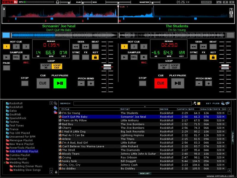
I tried to make it as functional, ergonomic, visible and as easy to use as possible.
Please post your suggestions.
Thanks.

Mensajes Thu 28 Apr 11 @ 7:40 am
Looks Nice and Clean....Can I make a suggestion? ok...ok more like a personal request!!...:)
Have you done any ISkins? I wish I knew codeing because I would do this myself....Sadly i am a hardwear and network engineer!!...:) so I am asking if you would make a simple ISkin for the IPAD....Just a single Deck with pitch, play, stop, and cue. But the platter will be almost the whole screen or what it can after adding the other buttons and sliders
I will test it if you need some one too...I ask because there is a real nice one now but it has a small platter and a lot ok cool features but I was just looking for a simple deck. I have 2 Ipads one for me and one for the Mrs...(ofcourse) and wanted to try it out aut one of my local spots?
Just making a suggestion.....
Mensajes Thu 28 Apr 11 @ 3:56 pm
My suggestions would be:
1) Larger browser area - Not a fan of giant pitch faders
2) Master VU Meter - This isn't on very many skins but I believe should be (CUE RMX skin has a great example of one)
Other than that, I like it. Very clean. Best of luck with it.
AC
1) Larger browser area - Not a fan of giant pitch faders
2) Master VU Meter - This isn't on very many skins but I believe should be (CUE RMX skin has a great example of one)
Other than that, I like it. Very clean. Best of luck with it.
AC
Mensajes Thu 28 Apr 11 @ 6:11 pm
superaceman wrote :
My suggestions would be:
1) Larger browser area - Not a fan of giant pitch faders
1) Larger browser area - Not a fan of giant pitch faders
There is a little icon called BROWSER_ZOOM. It looks like two little computer monitors, diagonally staggered. It is located all the way to the right, at the top of the browser section. If you click on it the whole skin becomes a browser. Pretty cool.
Giant pitch faders are for true mixing. I like to mix for real, using monitors and riding the pitch. With these large pitch faders I have greater resolution than on normal skins; my mouse almost feels like it travels the distance of a real pitch fader.
superaceman wrote :
2) Master VU Meter - This isn't on very many skins but I believe should be (CUE RMX skin has a great example of one)
VU meters are a great idea. I like it. But I wonder how useful they really are on a skin.
I use an external, hardware VU meter, racked right above my mixer. I calibrate it to peak when my amplifier's peak LED comes on. This allows me to not have to bend over while I'm playing to check my amp's level (my amp is racked and sits on the floor below the table where my console sits when I gig). I now have a visual indication alerting me to bring down my master level so as to not peak my amp.
But what is the use of a VU meter on a skin? I use an external mixer and configure my soundcard to "EXTERNAL MIXER". I max out my soundcard's, PC's and skin's volumes and adjust everything with my mixer's input gains.
If I could see the benefit of using a VU meter in the skin, I would incorporate one. Maybe I'm missing something here. I read somewhere that with recording softwares, when you lower the master volume on the GUI you are also lowering the bit rate, too. So as you lower the volume you are also lowering the quality of the audio.
If this is also the case with DJ softwares, I'd just assume max everything out in the software and adjust accordingly in my hardware. I haven't had an issue yet with bad sounding audio (distortion) coming from the soundcard when the skin's, soundcard's and PC volume levels are maxed out.
superaceman wrote :
Other than that, I like it. Very clean. Best of luck with it.
AC
AC
Thanks AC for your suggestions.
Mensajes Fri 29 Apr 11 @ 12:54 am
I have a strange habit of looking at my audience as I'm transitioning tracks to see their reactions (have done this for years). With an on screen VU meter I find it easier to keep the master level balanced as I can monitor the crowd and the mix at the same time. Although there is a master VU on my mixer, I rarely look down at it during the mix and sometimes find myself adjusting gain levels after wards.
Everyone has their different preferences which makes the software so amazing by having so many different choices of it's appearance. I admire what you skin builders do. Keep up the good work. :)
Everyone has their different preferences which makes the software so amazing by having so many different choices of it's appearance. I admire what you skin builders do. Keep up the good work. :)
Mensajes Fri 29 Apr 11 @ 1:37 am
Djmadman73 wrote :
Looks Nice and Clean....Can I make a suggestion? ok...ok more like a personal request!!...:)
Have you done any ISkins?
Have you done any ISkins?
No, brother. I never have. But as long as there is an xml and bmp file, we can get her done...
Djmadman73 wrote :
I wish I knew codeing because I would do this myself....Sadly i am a hardwear and network engineer!!...:)
I'm a hardware guy, too. Communications Electronics Technician. But honestly, after a while VDJScript starts to make sense. I'm still learning though. I'm still far away from being a true skinning master.
Djmadman73 wrote :
so I am asking if you would make a simple ISkin for the IPAD....Just a single Deck with pitch, play, stop, and cue. But the platter will be almost the whole screen or what it can after adding the other buttons and sliders
Sounds easy enough. The only thing kicking my ass right now is spinning platters and scratchzone. I can get the scratch zone to work, I just haven't mastered how to make the graphic move on the skin when you move it with the mouse. But the only reason I haven't yet is because none of my skins use jogwheels. But I'll figure it out.
Djmadman73 wrote :
I will test it if you need some one too...I ask because there is a real nice one now but it has a small platter and a lot ok cool features but I was just looking for a simple deck. I have 2 Ipads one for me and one for the Mrs...(ofcourse) and wanted to try it out aut one of my local spots?
Just making a suggestion.....
Just making a suggestion.....
Where can I find these IPad skins? So I can start working on it for you?
Mensajes Wed 04 May 11 @ 1:24 am
superaceman wrote :
I have a strange habit of looking at my audience as I'm transitioning tracks to see their reactions (have done this for years). With an on screen VU meter I find it easier to keep the master level balanced as I can monitor the crowd and the mix at the same time.
By balanced you mean making sure the that you are not coming in too loud or too low, correct? Not left and right balanced?
superaceman wrote :
Although there is a master VU on my mixer, I rarely look down at it during the mix and sometimes find myself adjusting gain levels after wards.
The VU meter on most DJ mixers mean nothing when it comes to "output" indication. They can't be calibrated and rarely indicate any useful information to the DJ. Going into the red rarely means you are distorting or clipping your output.
For the exception of the Rane MP 2016, going into the red don't mean s**t. Going into the red on the master outputs on a MP 2016 means you are distorting. You can hear it in the speakers. Going into the red on the channel fader means you are distorting your input. You can hear it in the headphones.
Having said that the only good indication that most DJ mixers' VU meters will give you is CUE level to MAIN level matching. Most DJ mixers that have a 10 segment LED or analog VU meters (my favorite) do a great job accurately indicating CUE level strength compared to MAIN level strength.
But what you want is a "loudness indication" of your output signal. You want a visual indication that your overall output (incoming track plus outgoing track) is the same at the end of the mix as it was at the beginning of the mix, correct?
I don't think a VU meter in the skin (or GUI) can give you an accurate indication.
I want to know my output signal strength. I also want to know that my amps are not clipping. This is why I use an outboard, hardware, adjustable level indicator. I tune it to indicate when my amps go into the red. It saves me from having to bend over to look at my amps clip LEDs.
You just can't achieve that in a skin. At least not to my knowledge.
superaceman wrote :
I admire what you skin builders do. Keep up the good work. :)
Thank you, I appreciate the compliment.
Mensajes Wed 04 May 11 @ 1:49 am
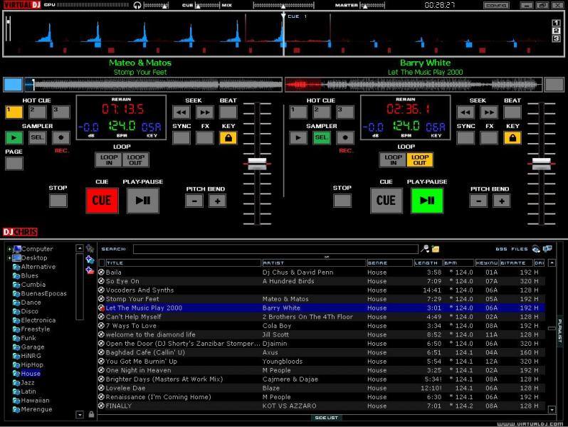
I've included more info in the LED info window. Lowered the pitch faders so they are more centered. Fixed the CUE font on the CUE buttons.

Mensajes Wed 04 May 11 @ 2:37 am
thats pretty straight forward chris...not for me but nice nonetheless...
Mensajes Wed 04 May 11 @ 6:00 am
thetracker510 wrote :
thats pretty straight forward chris...not for me but nice nonetheless...
Thanks. But why not for you? What's it missing? Or what is too much? What would make it for you?
Mensajes Thu 05 May 11 @ 6:15 am
Oh...I'm all about the Jogs ,Video screens,pannels,stuff like that...lol...
Mensajes Sun 08 May 11 @ 9:15 pm
thetracker510 wrote :
Oh...I'm all about the Jogs ,Video screens,pannels,stuff like that...lol...
Right on. I can understand that. You're right, this a minimalists' skin.
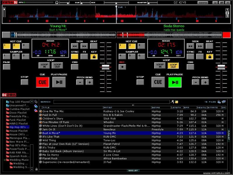
I've "upgraded" the buttons, LOL. They got the "pushed in" look when selected.
Fixed some of the symmetry (Loop buttons) and such.
Mensajes Tue 10 May 11 @ 4:18 am
Sorry for the slow reply..you can find the Iskin in the download section...
Mensajes Thu 12 May 11 @ 9:57 am
Djmadman73 wrote :
Sorry for the slow reply..you can find the Iskin in the download section...
Ok. I'll take a stab at it.
Mensajes Thu 12 May 11 @ 5:37 pm


